


We started by preserving the core structure of the original mark—the element customers already recognized. The key was a stylistic transformation: we replaced the boxy, sharp-edged elements with rounded fonts and introduced fluid curves to the surrounding graphic. The result is a refined logo that maintains the same basic shape but now has a softer, almost "blobby" feel, integrating visually with the essential element of their business: water.

We designed the 3D version by replacing the static, flat water icons with dynamic, dimensional 3D water splashes. This single change added incredible visual energy and depth. Rendered with subtle textures and reflective highlights, this new 3D asset was ready for his growing vehicle fleet, turning every BClearPools truck into a polished, high-impact billboard on the road.
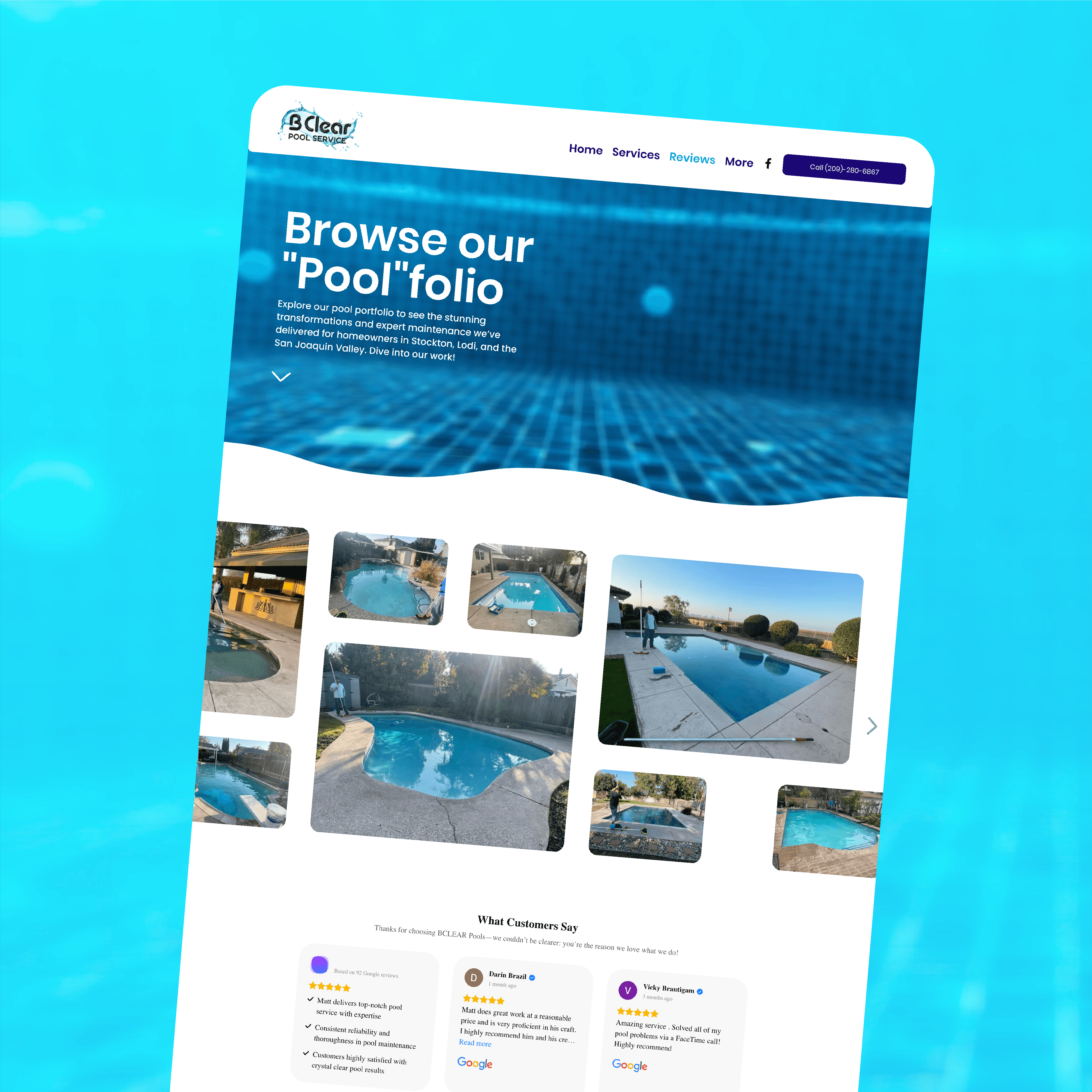
Our relationship with BClearPools goes beyond the logo. For the last four years, we have been responsible for the continuous design, development, and maintenance of their primary online hub, bclearpools.com.